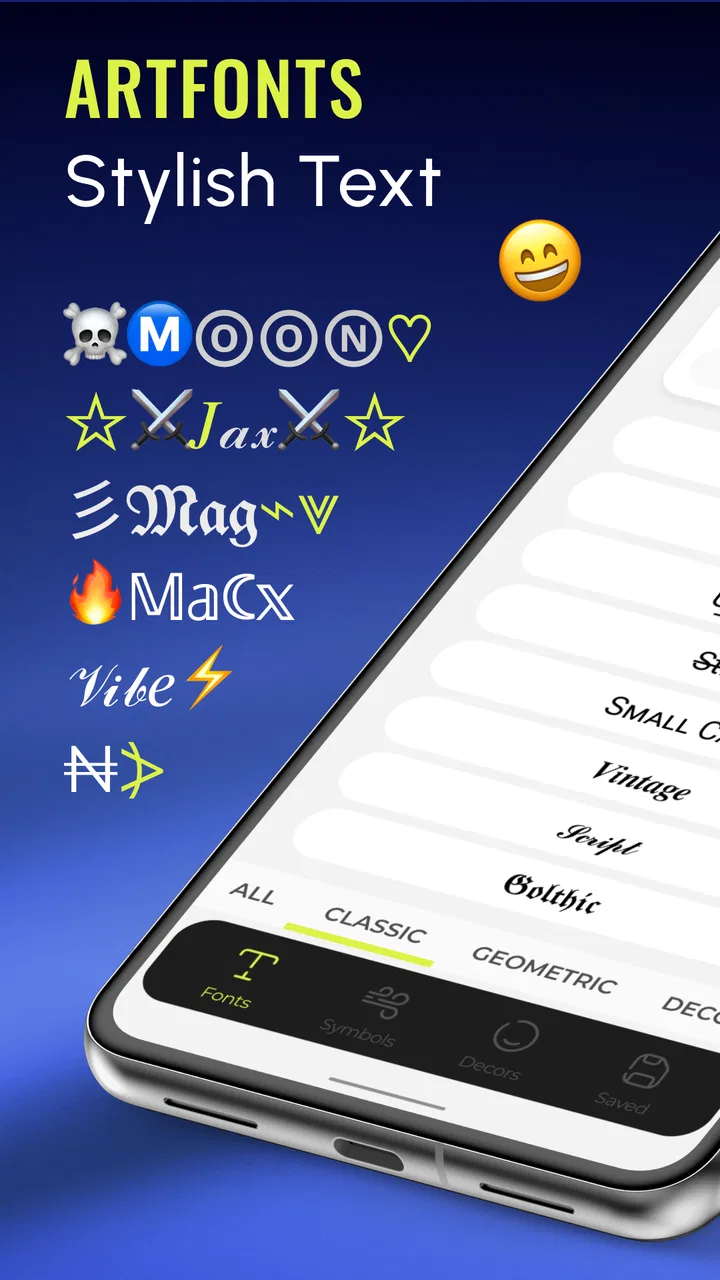
ArtFonts: Stylish Text
- 4.7
- Rating
- 10.00M
- Installs
- Free
- Price

 Analysis by App-foxy
I like customization tools that solve a small problem without turning my phone into a project, and ArtFonts: Stylish Text mostly succeeds on that front. It is a free personalization app from Galaxy studio apps that gives ordinary messages and social statuses a more decorative look through letter styles. The basic idea is simple: instead of sending plain text, I can choose a more eye-catching appearance and make a short caption, greeting, or profile line feel more personal.
That simplicity is also the app’s main strength. It is not trying to replace a full graphic-design editor, and I would not use it when I need carefully arranged typography, image editing, or a polished brand identity. I see it as a quick text-styling companion for moments when a normal keyboard feels too plain. After using it, my overall view is positive, with one important qualification: the value depends heavily on whether you enjoy decorative text enough to accept the extra step of choosing a style before sharing.
What the app is really useful for in everyday messaging
The most natural use is a short piece of text that needs a little personality. I can imagine using it for a birthday message, a social-status update, a nickname, a group-chat announcement, or a short caption that should stand out while remaining text rather than an image. That distinction matters. A styled text line is easier to copy, paste, and reuse than a graphic, and it keeps the message connected to the conversation instead of appearing as a separate picture.
You May Also Like

 Blood Strike: 2.5 Anniversary
Blood Strike’s Loadouts Turn Every Drop Into a Tactical Gamble
A close look at Blood Strike’s custom loadouts: how fast access to signature weapons reshapes its battle royale rhythm, rewards preparation, and narrows the gap between fights.

 Pandora - Music & Podcasts
Pandora’s Music Is Easy to Start, but Harder to Recover
Pandora’s strength is its low-effort path from a seed to a station. Its weak spot is how much confidence it asks you to place in connection, setup, and quiet recovery.

 8 Ball Pool
 Is Built on Rivalries, Rematches, and Routine
A close look at the rivalries, rematches, shared routines, and unanswered safety questions that turn a quick pool match into a persistent mobile community.

 Samsung Music
’s Quiet Strength Is Playing What You Already Own
Its reach comes less from spectacle than from dependable access to a personal library. That simplicity is both the app’s strongest retention engine and its ceiling.

 AccuWeather: Weather Radar
AccuWeather Review: A Quick, Clear Forecast for Everyday Decisions
For everyday plans, the best forecast is the one you can understand quickly. AccuWeather makes rain timing, radar, and local conditions easy to act on, with a few trade-offs.

 Hill Climb Racing
Why Hill Climb Racing Still Turns Crashes Into One More Run
A tiny car, a bumpy hill and one more upgrade: Hill Climb Racing keeps resurfacing because its simple chaos makes every near-miss feel personal.
More From Our News Desk



In a realistic everyday situation, I might be preparing a status for a weekend trip. With a standard keyboard, I would type the words, add an emoji, and move on. With this app, I can try a few letter treatments, choose one that remains readable, then paste the result into the service I am using. The process adds a small amount of friction, but it also gives me a clearer sense of occasion. The post feels deliberately made rather than typed in a hurry.
That workflow is especially convenient for short text. Decorative lettering can become difficult to scan when a sentence is long, so I would keep the main message plain and use the stylized version for a title, greeting, or emphasis. This is one of the more useful practical lessons from the app: the best-looking result is usually the most readable style, not the most elaborate one.
ArtFonts: Stylish Text is listed in the personalization category, and that description fits better than calling it a general writing tool. It changes how text looks, not what the text says. I would therefore judge it by speed, variety, readability, and how well the finished text behaves when moved into another app, rather than by expecting editing features that belong in a word processor or design suite.
Choosing styles without making messages hard to read
The strongest part of the experience is the freedom to treat different messages differently. A playful style may work for a nickname, while a cleaner style is more suitable for a status that friends need to understand quickly. I found that this makes the app more useful than a single novelty font: it can support several moods, provided I resist the temptation to decorate every word.
My practical approach would be to start with the shortest version of the message. If I want to share “movie night,” I would style those words first rather than formatting a full sentence. Short previews make it easier to compare letter shapes, notice awkward spacing, and decide whether the result still looks natural. Once the style works, I can expand the wording if it remains clear.
Another useful habit is to check the text after pasting it into the destination app. Different services may display unusual characters or decorative letter forms differently, and a style that looks attractive while being chosen may feel cramped or uneven in the final conversation. I would also avoid using highly ornate text for anything important, such as directions, schedules, or information that someone may need to copy accurately.
This is where the product differs from the usual alternatives. A normal keyboard is faster and more dependable, but it offers less visual personality. An image editor gives much more control over layout, color, and composition, but it creates a picture instead of flexible text. A social platform’s built-in formatting tools are convenient inside that platform, while a dedicated text-styling app is more focused on preparing wording that can be reused elsewhere. ArtFonts sits between those options: quicker than designing an image, more expressive than plain typing, and less seamless than a built-in keyboard feature.
Where it fits into a wider personalization setup
I would not treat this app as a complete phone-customization package. Its appeal is narrow and specific: it adds visual character to text used in messages and social statuses. That narrow focus is actually helpful for someone who does not want to install a large editor or learn a complicated interface just to make a line of text look different.
The app is also a better match for occasional creative use than for professional typography. If I were preparing a business announcement, a portfolio graphic, or a carefully branded campaign, I would choose a design tool that lets me control alignment, spacing, hierarchy, and export quality. ArtFonts is more appropriate for casual communication, community posts, personal profiles, and small moments where a bit of style is enough.
Its audience rating is Everyone, which matches the straightforward concept and makes it approachable for a broad range of users. Still, an age-friendly rating does not mean every style is suitable for every setting. I would encourage younger users in particular to preview text carefully before sharing, because decorative characters can change how a message is interpreted and may be harder for some people to read.
The app is free to install, which makes trying it low-risk. There are in-app purchases ranging from $0.99 to $99.99 per item, so I would pay attention to any purchase screen and decide whether the extra customization is genuinely useful before spending money. For me, the free starting point is enough to judge the central experience. I would not buy anything simply because a style looks novel for a few minutes; I would only consider it if I used the app regularly and the additional choice clearly improved my messages.
The main weakness is the extra step between writing and sending
My biggest criticism is not that the concept fails, but that it interrupts a habit that is normally instant. When I type in a regular keyboard, the words are already in the place where I want them. With a separate styling tool, I have to compose or prepare the text, choose an appearance, and then move it into another conversation or status field. For a one-line greeting, that can feel unnecessarily slow.
This matters most when I am replying quickly. If a friend asks a simple question, decorative text is rarely worth the delay. The app makes more sense when the message is intended to be noticed or when I am already in a creative mood. In other words, it adds value to presentation, not speed. Anyone looking for a keyboard replacement that automatically styles every message may find the workflow less convenient than expected.
Readability is the second limitation. Decorative lettering can be charming, but it can also make words look unfamiliar, especially when several unusual shapes are combined. Some recipients may need extra time to understand a heavily styled line, and screen readers or copying workflows may not treat every character exactly as ordinary text. I would keep important information in standard lettering and reserve the more expressive options for nonessential emphasis.
There is also a social trade-off. A styled status can attract attention, but using the same effect constantly may make messages feel noisy. I get more value when I use a distinctive style sparingly, perhaps for a heading or a special announcement, instead of turning every sentence into a visual display. The app gives me more options, but good results still depend on restraint.
The current version is 2.1.0, and the app supports devices running Android 7.0 or later. That makes it relevant to people using older Android phones as well as newer models, although I would still judge the experience on the particular phone and messaging service I use. Compatibility at installation is not the same as identical appearance everywhere, so checking the final pasted result remains a sensible step.
Who will get the most from ArtFonts
I would recommend it to people who regularly post short social updates, enjoy changing their online presentation, or want a quick way to make greetings and nicknames feel less ordinary. It is also a reasonable choice for someone who likes experimenting with text but does not want to learn a full design application. The app’s focused purpose means I can open it with a specific idea, test a few looks, and return to my normal apps without building an elaborate editing workflow.
It may be particularly useful for community moderators, hobby groups, and friends organizing informal events. A styled heading can help a short announcement stand apart in a busy chat, while the actual details can remain plain and easy to follow. That combination is more effective than formatting every line. I would use decorative text for “Game night” or “Reminder,” then write the time and location normally.
People who care about personal profiles may also enjoy it. A nickname or short status is a safer place to experiment than a long public statement, because the reader can understand the meaning even if the lettering is unusual. I would start there before using the app for longer posts.
On the other hand, I would skip it if my priority is the fastest possible messaging experience. A standard keyboard is better for rapid replies, accessibility, and consistent copying. I would also choose a graphic-design app instead if I needed control over colors, backgrounds, images, spacing, or a finished visual asset. ArtFonts is not a replacement for either option; its appeal lies in the small space between plain text and designed graphics.
The reception suggests that many people find the concept worthwhile: it has a 4.7 average from around 78 thousand ratings and has passed 5 million installs. Those figures indicate meaningful interest, but they do not remove the personal question of whether decorative text belongs in my own communication habits. I would judge it after trying several real messages, not after styling a single novelty phrase.
My verdict after weighing convenience against creativity
ArtFonts: Stylish Text is a focused personalization app with a clear purpose and a low barrier to experimentation. I like that it addresses a recognizable need without pretending to be a complete design studio. When I want a short message or status to feel more distinctive, it gives me a practical route from plain wording to something more expressive.
The strongest reason to use it is control over tone. A small change in lettering can make a greeting feel playful, a profile line feel more individual, or a short announcement easier to notice. The strongest reason not to use it is the workflow: preparing text outside the place where it will be sent is slower than typing normally, and elaborate styles can reduce clarity.
Galaxy studio apps has made a tool that works best when used selectively. I would keep it for captions, special occasions, nicknames, and short headings, while leaving everyday replies and important information in ordinary text. That approach avoids the app’s biggest weakness and makes its creative advantage more noticeable.
My recommendation is therefore positive but specific. Try it if you want decorative text for social communication and are comfortable spending an extra moment choosing a readable style. Skip it if you need instant typing, dependable accessibility, or full visual design control. For the right user, ArtFonts turns a plain line into a small personal signature without demanding a complicated editing routine.
FAQs for ArtFonts: Stylish Text
01What is ArtFonts: Stylish Text used for?
ArtFonts: Stylish Text is an application designed to enhance your text with unique and creative fonts. It allows users to customize their messages, social media posts, and other text-based content with a variety of stylish fonts and decorative elements. This app is perfect for anyone looking to make their text stand out.
02Is ArtFonts: Stylish Text free to use?
ArtFonts: Stylish Text offers both free and premium features. The free version provides access to a selection of fonts and basic customization options. For a wider array of fonts and advanced features, users can opt for in-app purchases or a subscription model, offering a more extensive experience.
03How easy is it to use ArtFonts: Stylish Text?
ArtFonts: Stylish Text is user-friendly, designed for people of all skill levels. The app features an intuitive interface that guides users through selecting and applying fonts. Even beginners can easily navigate through the options to create eye-catching text. The app also includes tutorials for additional guidance.
04Can I use ArtFonts: Stylish Text on social media platforms?
Yes, ArtFonts: Stylish Text is compatible with most social media platforms. Users can create customized text within the app and easily copy and paste it into posts on Instagram, Facebook, Twitter, and more. This flexibility makes it a popular choice for enhancing social media content.
05Does ArtFonts: Stylish Text support multiple languages?
ArtFonts: Stylish Text supports a range of languages, allowing users to apply stylish fonts to text in different languages. This feature makes the app versatile for users from various linguistic backgrounds, ensuring that everyone can enjoy creative text customization regardless of language.
Pros
- Wide variety of font styles available.
- User-friendly interface and navigation.
- Seamless integration with social media.
- Regular updates with new fonts.
- Lightweight and fast performance.
Cons
- Limited free font options.
- Contains occasional ads.
- Requires internet for full features.
- No option for custom font creation.
- Some fonts lack special characters.

ArtFonts: Stylish Text
Gallery